Accordion
Uses HTML <details>/<summary> for native expand/collapse. Plus icon toggles to minus when open. Default browser marker is removed including on Safari.
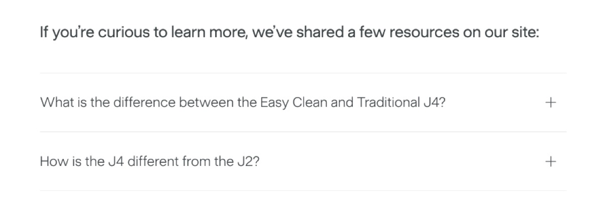
<div data-nama="accordion" class="nama-accordion"> <div data-nama="accordion-intro" class="nama-accordion-intro"> If you're curious to learn more, we've shared a few resources: </div> <div data-nama="accordion-items" class="nama-accordion-items"> <details data-nama="accordion-item" class="nama-accordion-item"> <summary>What is the difference between the J4 and J2?</summary> <p>The J4 has a wider feed chute and quieter motor.</p> </details> <details data-nama="accordion-item" class="nama-accordion-item"> <summary>Can I make nut milk with a cold press juicer?</summary> <p>Yes. Soak nuts overnight, then feed through alternating with water.</p> </details> </div></div>| Element | Style |
|---|---|
| Intro text | Sans-serif, 24px, 400 weight, -0.24px letter-spacing, charcoal. |
| Question (summary) | 21px, 300 weight, 1.6 line-height, charcoal. |
| Answer | Body-md, 300 weight, charcoal. Padding: 0 16px 28px 0. |
| Item borders | #f2f2f2 top + bottom. Items share borders (margin-top: -1px). |
| Item padding | 28px vertical, 16px right. |
| Plus/minus | CSS ::after, 1.25rem, auto right-aligned. + when closed, − when open. |
| Gap | 48px between intro and items. |
- The intro paragraph is optional — omit
accordion-introfor items with no preamble. - Each
<details>is independent — multiple can be open simultaneously. - Answer content can include multiple
<p>tags, links, or bold text. - No JavaScript needed — this is pure HTML + CSS.