Content Cards
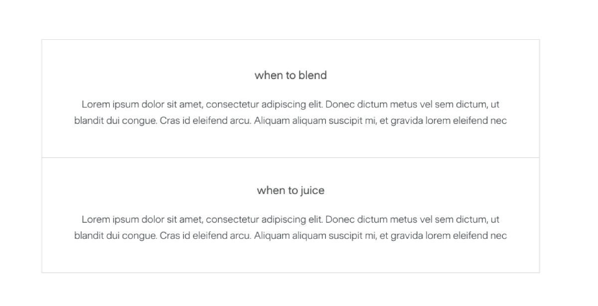
Simple centred content blocks with a thin grey border on all sides. When placed back-to-back, adjacent cards share their border so there’s no doubled line between them. Each card has a bold title and body paragraph.
Syntax
Section titled “Syntax”<div data-nama="content-card" class="nama-content-card"> <div data-nama="content-card-title" class="nama-content-card-title">when to juice</div> <p>Juicing is ideal when you want maximum nutrient absorption with minimal digestive effort.</p></div><div data-nama="content-card" class="nama-content-card"> <div data-nama="content-card-title" class="nama-content-card-title">when to blend</div> <p>Blending works best when you need sustained energy and satiety.</p></div>| Element | Style |
|---|---|
| Border | 1px solid #e0e0e0 on all four sides. Adjacent cards collapse the shared top border. |
| Padding | 48px desktop, 32px vertical / 24px horizontal mobile. |
| Text alignment | Centred. |
| Title | Sans-serif, 18px, 400 weight, 1.06 line-height, light-charcoal (#595D5A). 24px bottom margin. |
| Body | Sans-serif, 16px, 300 weight, 1.6 line-height, charcoal (#434C4E). |
- These work best in pairs — “when to juice / when to blend”, “pros / cons”, “before / after”. A single card is fine too for a boxed callout-style aside.
- Keep the title short (2–5 words) and lowercase for the editorial feel shown in the Figma designs.
- You can use more than two back-to-back. Three or four stack cleanly with shared borders.