Tables
Both table types use standard HTML <table> markup wrapped in a data-nama container. On mobile, tables bleed past the article gutter and scroll horizontally with hidden scrollbars. Columns are fixed at 180px on mobile to ensure readable content.
Data Table
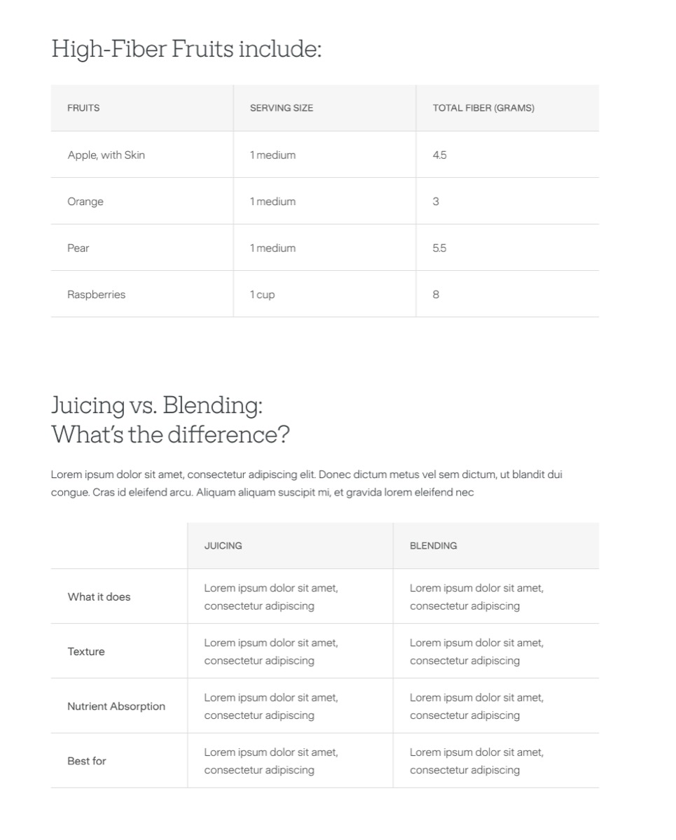
Section titled “Data Table”A straightforward table with an optional serif title above it. Header row gets a light grey background; body rows are white. All cells left-aligned.
Syntax
Section titled “Syntax”<div data-nama="table-title" class="nama-table-title">High-Fiber Fruits include:</div><div data-nama="table" class="nama-table"> <table> <thead> <tr> <th>Fruits</th> <th>Serving Size</th> <th>Total Fiber (Grams)</th> </tr> </thead> <tbody> <tr> <td>Apple, with Skin</td> <td>1 medium</td> <td>4.5</td> </tr> </tbody> </table></div>| Element | Style |
|---|---|
| Title | Serif, heading-sm, 300 weight, charcoal. 32px gap before table. |
| Header row | rgba(242,242,242,0.6) background. 14px uppercase, 400 weight, 0.28px letter-spacing, light-charcoal. |
| Header cell height | 68px |
| Body cells | 16px, 300 weight, 1.6 line-height, light-charcoal. 68px height. |
| Borders | #e0e0e0 bottom + right on every cell. No right border on last column. |
Comparison Table
Section titled “Comparison Table”A feature-comparison layout with an optional serif title and description paragraph above the table. The first column acts as a label column — it pins on mobile scroll so readers always see what row they’re looking at.
Syntax
Section titled “Syntax”<div data-nama="comparison-title" class="nama-comparison-title">Juicing vs. Blending: What's the difference?</div><div data-nama="comparison-desc" class="nama-comparison-desc">Description paragraph here.</div><div data-nama="comparison" class="nama-comparison"> <table> <thead> <tr> <th></th> <th>Juicing</th> <th>Blending</th> </tr> </thead> <tbody> <tr> <td>What it does</td> <td>Extracts liquid nutrients</td> <td>Blends whole ingredients</td> </tr> </tbody> </table></div>| Element | Style |
|---|---|
| Title | Serif, heading-sm, 300 weight, charcoal. 24px bottom margin. |
| Description | Body-md, 300 weight, charcoal. 32px bottom margin. |
| Header row | Same as data table. First cell: white background, sticky. |
Label column (first <td>) |
200px wide, 400 weight, sticky on mobile scroll, white background. |
| Body cells | Same as data table but 80px min-height. |
| Borders | Same pattern as data table. |
Mobile behaviour
Section titled “Mobile behaviour”Both tables scroll horizontally on mobile:
- Container bleeds past article gutters (negative margins)
- All cells get
min-width: 180px - Comparison table first column is pinned (
position: sticky) — it stays fixed while other columns scroll beneath it with a solid white background - Scrollbar is hidden
- The table uses
border-collapse: separateandoverflow: visibleto enable sticky positioning
- Use the data table for factual reference data — nutrition info, specifications, pricing tiers.
- Use the comparison table when the reader needs to weigh options — juicing vs blending, product models, plan features.
- Keep comparison tables to 2–3 value columns. More than that gets cramped even on desktop.
- Title and description are optional on both. Omit them for tables that flow naturally from the preceding paragraph.