Callouts & Popout
Three callout variants share a warm gray (#F9F9F7) background, plus a lighter popout with a kale accent border. All are pure CSS blocks.
Default (LG)
Section titled “Default (LG)”The standard callout. Large title with body text and optional bullet lists.
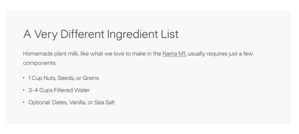
<div data-nama="callout" class="nama-callout"> <div data-nama="callout-title" class="nama-callout-title">A Very Different Ingredient List</div> <p>Homemade plant milk usually requires just a few components:</p> <ul> <li>1 Cup Nuts, Seeds, or Grains</li> <li>3–4 Cups Filtered Water</li> <li>Optional: Dates, Vanilla, or Sea Salt</li> </ul></div>| Element | Style |
|---|---|
| Title | Sans-serif, 32px, 300 weight, 1.06 line-height, charcoal. |
| Body | 16px, 300 weight, 1.6 line-height. |
| Bullet list | Custom 3px dot bullets, 8px gap between items, max-width 524px. |
SM (2-Column Data)
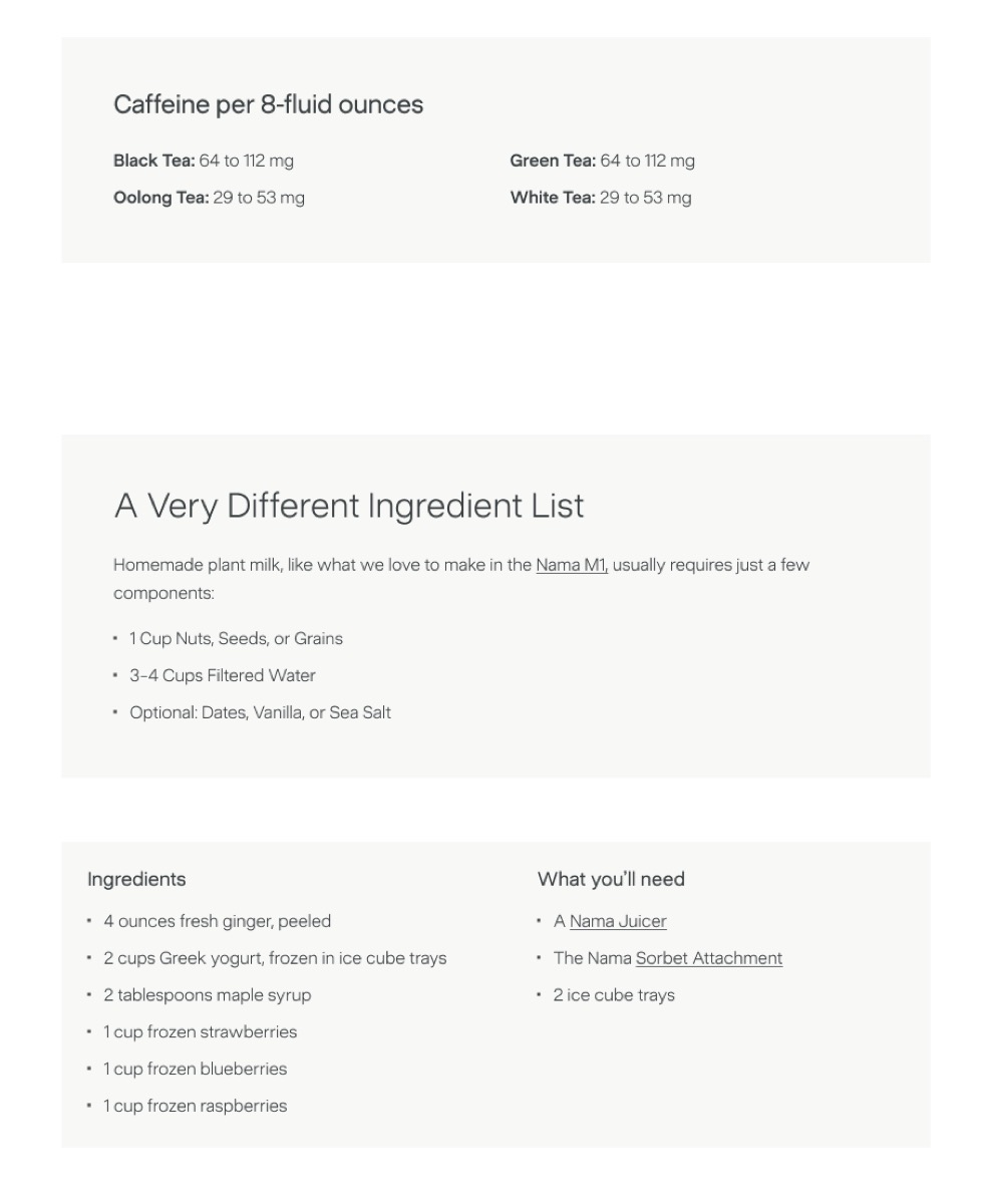
Section titled “SM (2-Column Data)”Smaller title with data pairs in two columns on desktop, stacking on mobile. Good for nutrition facts, specs, or reference data.
<div data-nama="callout" class="nama-callout nama-size-sm" data-size="sm"> <div data-nama="callout-title" class="nama-callout-title">Caffeine per 8-fluid ounces</div> <div data-nama="callout-body" class="nama-callout-body"> <div> <p><strong>Black Tea:</strong> 64 to 112 mg</p> <p><strong>Oolong Tea:</strong> 29 to 53 mg</p> </div> <div> <p><strong>Green Tea:</strong> 64 to 112 mg</p> <p><strong>White Tea:</strong> 29 to 53 mg</p> </div> </div></div>| Element | Style |
|---|---|
| Title | Sans-serif, 24px desktop / 18px mobile, 400 weight, -0.24px letter-spacing. |
| Data text | 16px desktop / 14px mobile, 300 weight. Bold labels use 500 weight. |
| Columns | Side-by-side on desktop (24px gap), stacked on mobile. |
Columns
Section titled “Columns”Side-by-side sections, each with its own title and list. No top-level title. Ideal for recipe ingredients + equipment, or any paired lists.
<div data-nama="callout" class="nama-callout nama-layout-columns" data-layout="columns"> <div data-nama="callout-section" class="nama-callout-section"> <div data-nama="callout-section-title" class="nama-callout-section-title">Ingredients</div> <ul> <li>4 ounces fresh ginger, peeled</li> <li>2 cups Greek yogurt, frozen in ice cube trays</li> <li>1 cup frozen strawberries</li> </ul> </div> <div data-nama="callout-section" class="nama-callout-section"> <div data-nama="callout-section-title" class="nama-callout-section-title">What you'll need</div> <ul> <li>A Nama Juicer</li> <li>The Nama Sorbet Attachment</li> <li>2 ice cube trays</li> </ul> </div></div>| Element | Style |
|---|---|
| Section title | Sans-serif, 18px, 400 weight, 1.04 line-height. |
| Section padding | 24px per section. |
| Layout | Side-by-side on desktop, stacked on mobile. |
Inline Popout
Section titled “Inline Popout”A lighter alternative — kale-tinted background with a 2px kale left border. Use it for tips, asides, or editorial notes that don’t need a title.
<div data-nama="popout" class="nama-popout"> <p>Juicing is a great entry point for beginning your journey to a better diet. Start with simple recipes and work your way up.</p></div>| Element | Style |
|---|---|
| Background | Kale at 5% opacity |
| Left border | 2px solid kale |
| Padding | 32px all sides |
| Margin | 40px top and bottom |
Body text inside inherits the article’s default body-md styling — 16px, 300 weight, 1.6 line-height.
- Use Default for explanatory content with a title — ingredient lists, how-tos, key takeaways.
- Use SM for quick-reference data that scans in pairs — nutrition, specs, pricing.
- Use Columns for paired lists that belong together — recipe ingredients + tools, pros + cons.
- Use Popout for brief tips or asides — one or two paragraphs, no title needed.
- All variants can contain links, bold text, and standard HTML. Bullet lists inherit the custom dot style.