Image Lockups
A CSS columns-based masonry layout. Images with different aspect ratios flow naturally into columns without forced equal heights. Drop in as many images as you need.
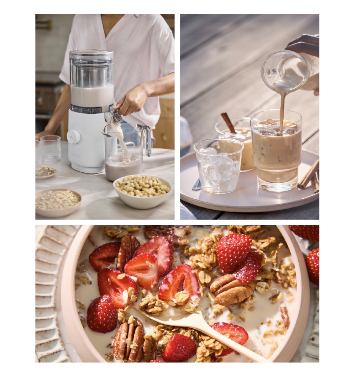
<div data-nama="image-lockup" class="nama-image-lockup" data-columns="2"> <img src="https://cdn.shopify.com/...1.webp" alt="Description"> <img src="https://cdn.shopify.com/...2.webp" alt="Description"> <img src="https://cdn.shopify.com/...3.webp" alt="Description"> <img src="https://cdn.shopify.com/...4.webp" alt="Description"></div>Column Options
Section titled “Column Options”| Attribute | Mirror class | Columns | Mobile |
|---|---|---|---|
data-columns="2" or omitted |
— | 2 | 2 |
data-columns="3" |
.nama-columns-3 |
3 | 2 |
data-columns="4" |
.nama-columns-4 |
4 | 2 |
Add the mirror class alongside the data attribute for visual editor durability.
| Element | Style |
|---|---|
| Column gap | 8px. |
| Image gap | 8px bottom margin between images in a column. |
| Images | width: 100%, break-inside: avoid, natural aspect ratio preserved. |
Flex Layout
Section titled “Flex Layout”Add data-layout="flex" for a side-by-side row where images are sized by their natural aspect ratio. Use data-split for explicit width control. Both images top-align. Stacks on mobile.
<!-- Auto: images sized by aspect ratio --><div data-nama="image-lockup" class="nama-image-lockup nama-layout-flex" data-layout="flex">  <img src="https://cdn.shopify.com/...wide.webp" alt="Wide image">  <img src="https://cdn.shopify.com/...narrow.webp" alt="Narrow image"></div>
<!-- Explicit 65/35 split --><div data-nama="image-lockup" class="nama-image-lockup nama-layout-flex nama-split-65-35" data-layout="flex" data-split="65-35"> <img src="https://cdn.shopify.com/...left.webp" alt="Large image"> <img src="https://cdn.shopify.com/...right.webp" alt="Small image"></div>| Split | Mirror class | Left | Right |
|---|---|---|---|
| (omit) | — | Equal flex | Equal flex |
data-split="60-40" |
.nama-split-60-40 |
60% | 40% |
data-split="65-35" |
.nama-split-65-35 |
65% | 35% |
data-split="70-30" |
.nama-split-70-30 |
70% | 30% |
data-split="40-60" |
.nama-split-40-60 |
40% | 60% |
data-split="35-65" |
.nama-split-35-65 |
35% | 65% |
data-split="30-70" |
.nama-split-30-70 |
30% | 70% |
- Masonry (
data-columns) — best for 3+ images with varied aspect ratios. Images flow into columns and stagger naturally. - Flex (
data-layout="flex") — best for 2 images side by side at different widths. Use for article hero pairings where one image is larger than the other. - The guide articles on the old site used roughly a 65-35 split for their hero image pairs.
- Images maintain their natural proportions — no cropping or forced heights.