Text Image Split
A flexible two-column layout pairing text content with an image. Supports tags (pill style), headings at three sizes, body text, and any button style. Stacks on mobile.
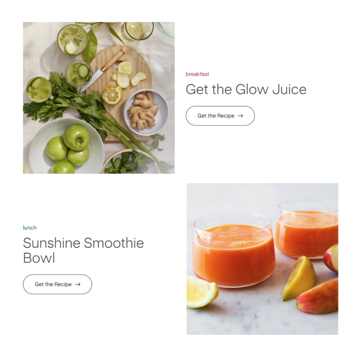
Basic Syntax
Section titled “Basic Syntax”<div data-nama="text-image" class="nama-text-image"> <div data-nama="text-image-content" class="nama-text-image-content"> <p>Text content here.</p> </div> <div data-nama="text-image-media" class="nama-text-image-media"> <img src="https://cdn.shopify.com/..." alt="Description"> </div></div>Options
Section titled “Options”| Attribute | Mirror class | What it does |
|---|---|---|
data-image-position="left" |
.nama-image-left |
Moves image to the left, text to the right. Default is image right. |
data-align="center" |
.nama-align-center |
Vertically centers text against the image. Default is top-aligned. |
Always add the mirror class alongside the data attribute for visual editor durability.
Content Elements
Section titled “Content Elements”All elements inside text-image-content are optional. Use what you need:
<div data-nama="text-image-content" class="nama-text-image-content"> <div data-nama="text-image-tag" class="nama-text-image-tag">plant-based milk</div> <div data-nama="text-image-heading" class="nama-text-image-heading">Why Make Your Own?</div> <p>Body text here.</p> <a href="/link" class="btn btn-sm"><span>Learn More</span></a></div>Pill style matching the theme’s tag block — rounded-full, border, lowercase.
Heading
Section titled “Heading”Uses data-nama="text-image-heading" with an optional data-heading-size attribute:
| Size | Font Size | Usage |
|---|---|---|
| (default) | — | 36px |
data-heading-size="md" |
.nama-heading-md |
48px |
data-heading-size="xs" |
.nama-heading-xs |
24px |
All sizes: sans-serif, 300 weight, 1.06 line-height, light-charcoal.
Buttons
Section titled “Buttons”Any button class works inside text-image-content:
btn btn-sm— default small buttonbtn btn-secondary btn-sm— secondary stylebtn-link— text link with arrow (standalone class, don’t combine with.btn)
Buttons get margin-top: 24px automatically.
Mobile
Section titled “Mobile”Both columns stack vertically. Image position is ignored — content always comes first, image below.